

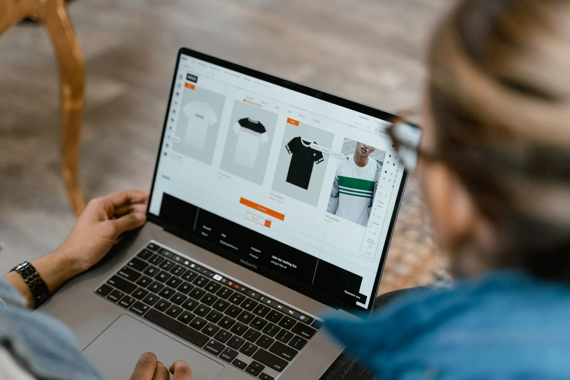
When sales are low, the usual response is to look for more traffic. Often the problem is the page that the traffic lands on. A visitor arrives with questions, and if your page doesn't answer them in a few seconds, they leave without telling you why. The good news is that product pages are one of the most fixable parts of a store.
The questions every visitor has
Mentally walk through the page as a stranger:
- What is this?
- Is it right for me?
- What does it cost, in total?
- When will it arrive?
- What if it does not work out?
- Can I trust this store?
Every part of the page should help answer one of those.
Photos and video
Images do most of the selling online. Use several: the product on its own, in use, a size reference and a close-up of the details. Real photos from a sample you ordered beat supplier images. A short video showing the item in use answers questions a still photo can't.
Compress images so the page loads quickly, particularly on mobile, where most shoppers browse.
Title and opening line
The title should say what the product is in plain words, with the key search term. The line below it should say why it matters to the customer. Avoid titles made of keyword lists.
Price and shipping
Show the price clearly, and state delivery time and shipping cost on the page, not just at checkout. Surprises at checkout are a major reason for abandoned carts. Be honest about long delivery, as explained in shipping times from China.
Description that helps
Short, scannable and specific: a few lines about the benefit, bullets with the key details, measurements and what is in the box. Write it in your own voice rather than pasting the supplier's text (see brand voice).
Reviews and proof
Real customer reviews are the strongest trust signal you can have. If you do not have any yet, use other forms of proof: a clear return policy, a visible contact address, photos of the real product, and a short story about who you are. Do not invent reviews. It is dishonest and, in many countries, illegal.
A clear button
One main call to action, visible without scrolling on mobile, with wording like "Add to cart". On small screens, a button that stays at the bottom works well.
Policies and trust
Link your return, shipping and privacy policies, show accepted payment methods and make it easy to contact you. Small stores that look real are trusted more.
How to test your own page
- Open it on your phone and look at it for five seconds. What did you notice first?
- Ask someone unfamiliar with the product what it is and what it costs.
- Look at where visitors drop off in your analytics.
- Change one thing at a time and compare results over enough orders.
Fixing a weak page is usually cheaper than buying more traffic. For the whole picture before opening, see our launch checklist.
Product research, store research, ads spy and video dropshipping in one place.